
Part 6: Modals
Time to build the modal screens for theme and accent selection. We’ll create interactive components that leverage Unistyles’ powerful theming system and introduce ScopedTheme for previewing themes.
Create SettingOptionRadio Component
Let’s start with a radio button component for selecting theme modes. This component brings together concepts we’ve covered in previous steps.
Create components/SettingOptionRadio.tsx:
import { Pressable, PressableStateCallbackType, View } from 'react-native'import { StyleSheet, type UnistylesVariants } from 'react-native-unistyles'import { ThemedText } from './ThemedText'
interface SettingOptionRadioProps extends UnistylesVariants<typeof style> {    label: string,    onPress(): void}
export const SettingOptionRadio: React.FunctionComponent<SettingOptionRadioProps> = ({    label,    isSelected,    onPress}) => {    style.useVariants({        isSelected    })
    return (        <Pressable            onPress={onPress}            style={style.container}        >            <ThemedText type="subtitle">                {label}            </ThemedText>            <View style={style.radio}>                {isSelected && (                    <View style={style.radioInner} />                )}            </View>        </Pressable>    )}
const style = StyleSheet.create(theme => ({    container: (state: PressableStateCallbackType) => ({        flexDirection: 'row',        alignItems: 'center',        justifyContent: 'space-between',        gap: 8,        borderRadius: theme.gap(1),        padding: theme.gap(2),        borderWidth: 1,        borderColor: theme.colors.dimmed,        opacity: state.pressed ? 0.75 : 1,    }),    radio: {        width: 24,        height: 24,        borderRadius: 12,        borderWidth: 2,        justifyContent: 'center',        alignItems: 'center',        variants: {            isSelected: {                true: {                    borderColor: theme.colors.tint,                },                false: {                    borderColor: theme.colors.dimmed,                }            }        }    },    radioInner: {        width: 10,        height: 10,        borderRadius: 5,        backgroundColor: theme.colors.tint,    }}))
This component combines everything we’ve learned: useVariants for the radio selection state, boolean variants for styling, PressableStateCallbackType for press feedback, and UnistylesVariants for type safety.
Basic Theme Settings Screen
Let’s add this component to the theme settings screen:
import { ThemedText } from '@/components/ThemedText' import { SettingOptionRadio } from '@/components/SettingOptionRadio' import React from 'react'import { ScrollView } from 'react-native'import { StyleSheet } from 'react-native-unistyles'
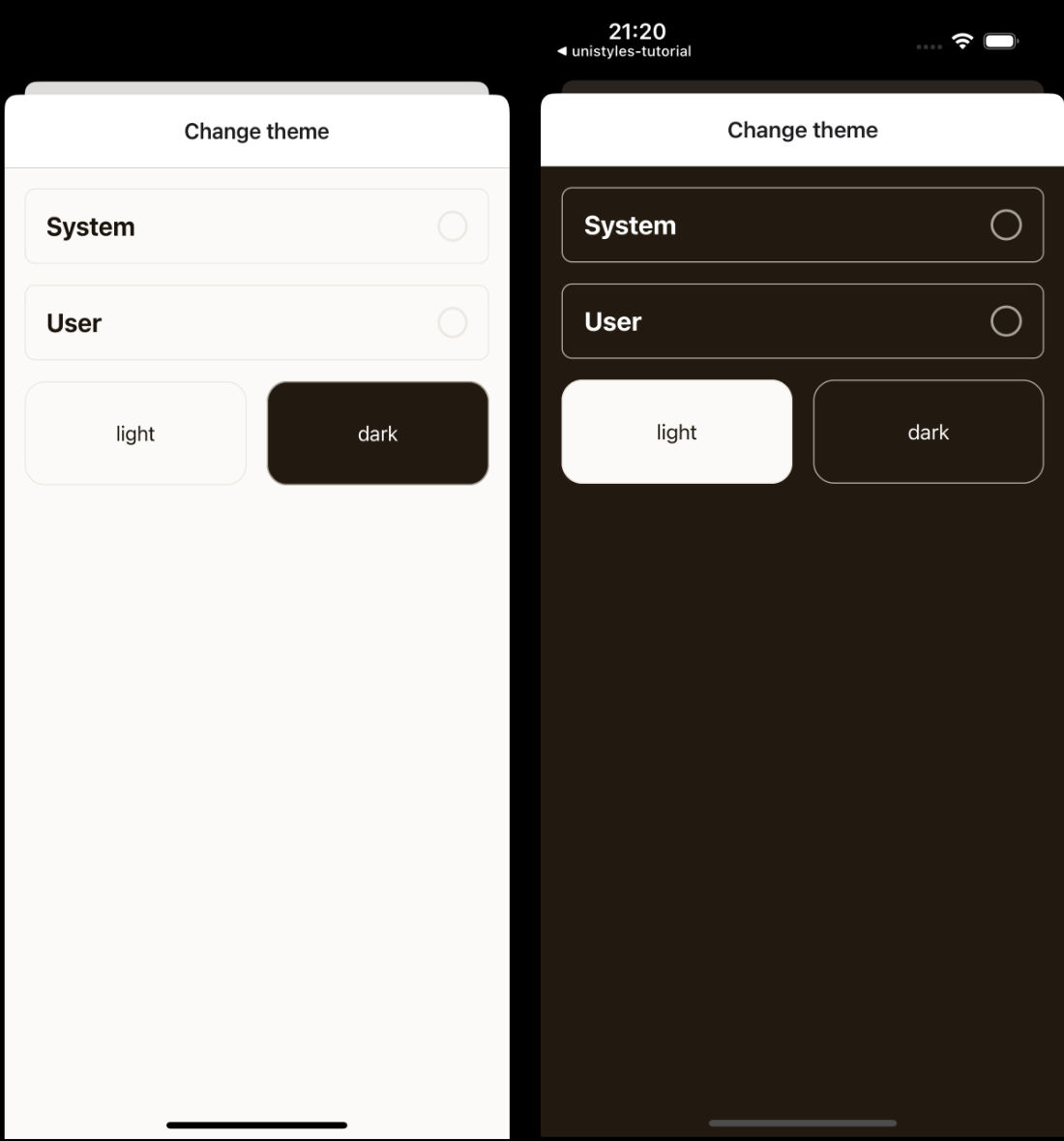
export default function SettingsThemeScreen() { return ( <ScrollView contentContainerStyle={styles.container}> <ThemedText type="title"> Change theme </ThemedText> <SettingOptionRadio label="System" isSelected={false} onPress={() => {}} /> <SettingOptionRadio label="User" isSelected={false} onPress={() => {}} /> </ScrollView> )}
const styles = StyleSheet.create(theme => ({ container: { flex: 1, gap: theme.gap(2), paddingTop: theme.gap(2), paddingHorizontal: theme.gap(2) }}))Create ThemeColor Component
Now let’s create a component called ThemeColor that will preview different themes.
import { Pressable } from 'react-native'import { ScopedTheme, StyleSheet, UnistylesThemes } from 'react-native-unistyles'import { ThemedText } from './ThemedText'
type ThemeColorProps = {    label: keyof UnistylesThemes,    onPress: VoidFunction}
export const ThemeColor: React.FunctionComponent<ThemeColorProps> = ({ label, onPress }) => {    return (        <ScopedTheme name={label}>            <Pressable                style={styles.container}                onPress={onPress}            >                <ThemedText>                    {label}                </ThemedText>            </Pressable>        </ScopedTheme>    )}
const styles = StyleSheet.create(theme => ({    container: {        flex: 1,        height: 80,        borderRadius: theme.gap(2),        alignItems: 'center',        justifyContent: 'center',        borderWidth: 1,        borderColor: theme.colors.dimmed,        backgroundColor: theme.colors.background    }}))
Here’s were things getting interesting. We’ve used new component called ScopedTheme.
ScopedTheme empowers you to render child components with a specific, fixed theme, regardless of the current global app theme.
This feature ensures consistent theming in scenarios like theme previews or within specific screens like camera, where a predetermined visual contract is required.
In other words, if you want some of your components to always use a specific theme, you can use ScopedTheme.
Before proceeding further, notice that we used keyof UnistylesTheme (as label type) to ensure type safety. This type represents the keys of all the themes you’ve registered within Unistyles.
Enhanced Theme Settings Screen
Let’s update the theme settings screen to include theme previews:
import { SettingOptionRadio } from '@/components/SettingOptionRadio' import { ThemeColor } from '@/components/ThemeColor'import React from 'react' import { ScrollView, View } from 'react-native' import { ScrollView } from 'react-native'import { StyleSheet } from 'react-native-unistyles'
export default function SettingsThemeScreen() {  return (    <ScrollView contentContainerStyle={styles.container}>        <SettingOptionRadio            label="System"            isSelected={false}            onPress={() => {}}        />        <SettingOptionRadio            label="User"            isSelected={false}            onPress={() => {}}        />       <View style={styles.row}>           <ThemeColor               label="light"               onPress={() => {}}           />           <ThemeColor               label="dark"               onPress={() => {}}           />       </View>    </ScrollView>  )}
const styles = StyleSheet.create(theme => ({    container: {        flex: 1,        gap: theme.gap(2),        paddingTop: theme.gap(2),        paddingHorizontal: theme.gap(2)    },   row: {       justifyContent: 'center',       flexDirection: 'row',       gap: theme.gap(2)   }}))
Change your phone’s color scheme and observe that ScopedTheme prevents the boxes from re-rendering with the opposite color palette.
Complete Theme Settings Implementation
Now let’s add the full functionality using UnistylesRuntime and useUnistyles:
import { SettingOptionRadio } from '@/components/SettingOptionRadio'import { ThemeColor } from '@/components/ThemeColor'import React from 'react'import { ScrollView, View } from 'react-native' import { StyleSheet, UnistylesRuntime, useUnistyles } from 'react-native-unistyles' import { StyleSheet } from 'react-native-unistyles'
export default function SettingsThemeScreen() {  const { rt } = useUnistyles()
  return (    <ScrollView contentContainerStyle={styles.container}>        <SettingOptionRadio            label="System"            isSelected={rt.hasAdaptiveThemes}            onPress={() => {              if (rt.hasAdaptiveThemes) {                return              }
              UnistylesRuntime.setAdaptiveThemes(true)            }}            isSelected={false}            onPress={() => {}}        />        <SettingOptionRadio            label="User"            isSelected={!rt.hasAdaptiveThemes}            onPress={() => {              if (rt.hasAdaptiveThemes) {                UnistylesRuntime.setAdaptiveThemes(false)              }            }}            isSelected={false}            onPress={() => {}}        />        {!rt.hasAdaptiveThemes && (            <View style={styles.row}>                <ThemeColor                    label="light"                    onPress={() => UnistylesRuntime.setTheme('light')}                    onPress={() => {}}                />                <ThemeColor                    label="dark"                    onPress={() => UnistylesRuntime.setTheme('dark')}                    onPress={() => {}}                />            </View>        )}    </ScrollView>  )}
Here’s what makes this implementation powerful:
Using useUnistyles for subscriptions: We use useUnistyles to get the rt object, which creates a subscription and only re-renders the screen when hasAdaptiveThemes changes. Other runtime values won’t trigger unnecessary re-renders.
Theme management logic: We can’t change themes when adaptive themes are enabled. Adaptive themes follow the device’s color scheme and automatically switch themes. Allowing manual theme switching would interfere with this system, so we disable theme selection when adaptive themes are active.
Type-safe theme switching: UnistylesRuntime.setTheme() provides TypeScript hints for all available theme names, making it impossible to set an invalid theme.
Try playing with different settings to see how the app adapts to your choices.
Update navigation header colors
As you probably noticed, navigation header colors are not updated when theme changes. Let’s fix that by updating app/(tabs)/settings/_layout.tsx file:
import { Stack } from 'expo-router'import React from 'react'import { useUnistyles } from 'react-native-unistyles'
export default function SettingsLayout() {    const { theme } = useUnistyles()
    return (        <Stack            screenOptions={{                headerTitleStyle: {                    color: theme.colors.typography                },                headerStyle: {                    backgroundColor: theme.colors.background                },                contentStyle: {                    backgroundColor: theme.colors.background                }            }}        >            <Stack.Screen                name="index"                options={{                    title: 'Settings',                    headerShown: false                }}            />            <Stack.Screen                name="settings-theme"                options={{                    title: 'Change theme',                    presentation: 'modal',                    headerShown: true                }}            />            <Stack.Screen                name="settings-accent"                options={{                    title: 'Change accent',                    presentation: 'modal',                    headerShown: true                }}            />        </Stack>    )}
That’s all for theme settings screen!
Create Button Component
Now let’s learn something new. We will create an animated button component for the accent settings:
import { Pressable } from 'react-native'import Animated from 'react-native-reanimated'import { StyleSheet, UnistylesVariants } from 'react-native-unistyles'import { ThemedText } from './ThemedText'
interface ButtonProps extends UnistylesVariants<typeof style> {    label: string,    onPress(): void}
export const Button: React.FunctionComponent<ButtonProps> = ({    label,    accent,    onPress}) => {    style.useVariants({        accent: accent    })
    return (        <Pressable onPress={onPress}>            <Animated.View style={style.button}>                <ThemedText bold>                    {label}                </ThemedText>            </Animated.View>        </Pressable>    )}
const style = StyleSheet.create(theme => ({    button: {        width: '100%',        padding: theme.gap(2),        justifyContent: 'center',        alignItems: 'center',        borderRadius: theme.gap(1)    },    buttonColor: {        variants: {            accent: {                banana: {                    backgroundColor: theme.colors.accents.banana                },                pumpkin: {                    backgroundColor: theme.colors.accents.pumpkin                },                apple: {                    backgroundColor: theme.colors.accents.apple                },                grass: {                    backgroundColor: theme.colors.accents.grass                },                storm: {                    backgroundColor: theme.colors.accents.storm                },                default: {                    backgroundColor: theme.colors.accents.banana                }            }        }    }}))
You should be familiar with all the patterns used here: variants, UnistylesVariants type, and useVariants for dynamic styling.
So no extra comment is needed. Let’s add few more lines of code to showcase Reanimated integration.
import { Pressable } from 'react-native'import Animated, { useAnimatedStyle, withTiming } from 'react-native-reanimated'import { StyleSheet, UnistylesVariants } from 'react-native-unistyles' import { useAnimatedVariantColor } from 'react-native-unistyles/reanimated'import { ThemedText } from './ThemedText'
interface ButtonProps extends UnistylesVariants<typeof style> {    label: string,    onPress(): void}
export const Button: React.FunctionComponent<ButtonProps> = ({    label,    accent,    onPress}) => {    style.useVariants({        accent: accent    })
    const color = useAnimatedVariantColor(style.buttonColor, 'backgroundColor')    const animatedStyle = useAnimatedStyle(() => ({        backgroundColor: withTiming(color.value, {            duration: 500        })    }))
    return (        <Pressable onPress={onPress}>            <Animated.View style={style.button}>            <Animated.View style={[animatedStyle, style.button]}>                <ThemedText bold>                    {label}                </ThemedText>            </Animated.View>        </Pressable>    )}
// no changes in styles
The useAnimatedVariantColor hook allows you to reuse Unistyles variants and easily animate them with Reanimated. You simply pass a style that uses variants and select which color property should be animated. TypeScript automatically hints all available color properties.
The hook returns a SharedValue from Reanimated, so you’re free to use any animation logic you want. You’ll see this in action in the next section when we implement the accent settings screen.
With just 5 lines of code, we connected Unistyles to Reanimated and animated the button’s background color based on the selected accent variant.
Before moving on, there’s one crucial point: understanding how to merge styles created by Unistyles.
In the <Animated.View> component, we used the syntax [animatedStyle, style.button] to merge styles.
This approach is essential when working with Unistyles. The reason for this specific merging method is that each style managed by Unistyles contains a hidden JSI NativeState.
This state, stored on the object as an invisible property accessible only via a Symbol, is vital for Unistyles’ internal operation.
Using the spread operator or other object merging techniques will result in the loss of this state and unpredictable behavior.
For a comprehensive explanation, please refer to our dedicated guide on Merging styles.
Build the Accent Settings Modal
Let’s create the final modal screen for accent selection and animate the accent selection:
import { Button } from '@/components/Button'import { ThemedText } from '@/components/ThemedText'import { router } from 'expo-router'import React, { useState } from 'react'import { Pressable, ScrollView, View } from 'react-native'import { StyleSheet, useUnistyles } from 'react-native-unistyles'
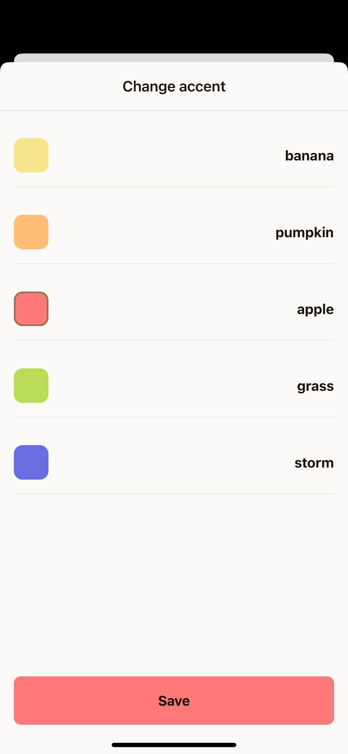
export default function SettingsAccentScreen() { const { theme } = useUnistyles() const allAccents = theme.colors.accents const [selectedAccent, setSelectedAccent] = useState('banana')
return ( <View style={styles.container}> <ScrollView contentContainerStyle={styles.scrollView}> <View style={styles.row}> {Object.entries(allAccents).map(([accentName, accentColor]) => ( <Pressable key={accentName} style={styles.item} onPress={() => { setSelectedAccent(accentName as keyof typeof allAccents) }} > <View style={styles.box(accentColor, accentName === selectedAccent)}/> <ThemedText bold> {accentName} </ThemedText> </Pressable> ))} </View> </ScrollView> <View style={styles.buttonContainer}> <Button label="Save" accent={selectedAccent} onPress={() => { router.back() }} /> </View> </View> )}
const styles = StyleSheet.create((theme, rt) => ({ container: { flex: 1 }, scrollView: { flex: 1, gap: theme.gap(2), paddingTop: theme.gap(2), paddingHorizontal: theme.gap(2) }, box: (accentColor: string, isSelected: boolean) => ({ height: 40, width: 40, backgroundColor: accentColor, borderRadius: 10, borderWidth: isSelected ? 2 : 0, borderColor: theme.colors.tint }), row: { flexWrap: 'wrap', flexDirection: 'row', gap: theme.gap(2) }, item: { flexDirection: 'row', alignItems: 'center', gap: theme.gap(2), paddingVertical: theme.gap(2), width: '100%', justifyContent: 'space-between', borderBottomWidth: 1, borderBottomColor: theme.colors.dimmed }, buttonContainer: { marginBottom: rt.insets.bottom, paddingHorizontal: theme.gap(2) }}))This screen uses useUnistyles to subscribe to theme changes, allowing us to iterate over all available accent colors. Users can select different accents by tapping the colored boxes, and the selection updates the local state.
The Button component animates beautifully thanks to the useAnimatedVariantColor hook, with a smooth 500ms transition between different accent colors.
Perfect! You now have fully functional modal screens that demonstrate the power of Unistyles’ theming system. Users can switch between system and manual theme modes, select different themes, and choose from various accent colors - all with smooth animations and immediate visual feedback.