
Part 5: Settings screen
Time to bring our settings screen to life! We’ll create a beautiful settings interface that showcases how Unistyles integrates seamlessly with React Native’s Pressable component and explore the difference between UnistylesRuntime and the rt object.
Our settings screen will feature interactive tiles that users can tap to modify the app’s appearance.
Create the SettingTile Component
Let’s start by creating a reusable SettingTile component. This component will demonstrate one of Unistyles’ coolest features: zero-config integration with Pressable and PressableStateCallbackType.
Create a new file components/SettingTile.tsx:
import { Pressable, PressableStateCallbackType, View } from 'react-native'import { StyleSheet } from 'react-native-unistyles'import { ThemedText } from './ThemedText'
type SettingTileProps = {    settingName: string,    selectedValue: string,    description: string,    onPress(): void}
export const SettingTile: React.FunctionComponent<SettingTileProps> = ({    settingName,    selectedValue,    description,    onPress}) => {    return (        <Pressable            style={styles.container}            onPress={onPress}        >            <View>                <ThemedText bold>                    {settingName}                </ThemedText>                <ThemedText dimmed>                    {description}                </ThemedText>            </View>            <ThemedText>                {selectedValue}            </ThemedText>        </Pressable>    )}
const styles = StyleSheet.create({    container: (state: PressableStateCallbackType) => ({        flexDirection: 'row',        alignItems: 'center',        justifyContent: 'space-between',        opacity: state.pressed ? 0.75 : 1,    })})
This is where Unistyles really shines! Notice how we pass the PressableStateCallbackType directly to our style function. No extra configuration needed - Unistyles automatically recognizes that this style depends on the pressable state and handles all the complexity for you.
When you press the tile, the opacity changes from 1 to 0.75, giving users immediate visual feedback.
Enhance ThemedText with Variants
You might have noticed we’re using bold and dimmed props on ThemedText that don’t exist yet. Let’s add them using Unistyles variants.
Update your ThemedText component:
import { Text, type TextProps } from 'react-native'import { StyleSheet, type UnistylesVariants } from 'react-native-unistyles'
export type ThemedTextProps = TextProps & UnistylesVariants<typeof styles>
export function ThemedText({  style,  type,  bold,  dimmed,  ...rest}: ThemedTextProps) {  styles.useVariants({    type,    bold,    dimmed  })
  return (    <Text      style={[        styles.textColor,        styles.textType,        style,      ]}      {...rest}    />  );}
const styles = StyleSheet.create(theme => ({  textColor: {    color: theme.colors.typography  },  textType: {    variants: {      type: {        default: {          fontSize: 16,          lineHeight: 24,        },        title: {          fontSize: 32,          fontWeight: 'bold',          lineHeight: 32,        },        subtitle: {          fontSize: 20        },        link: {          lineHeight: 30,          fontSize: 16,          color: '#0a7ea4',        },      },      bold: {        true: {          fontWeight: 'bold',        }      },      dimmed: {        true: {          color: theme.colors.tint        }      }    }  }}));
Boolean variants are incredibly powerful. Unityles supports variants with boolean values like true and false
that can be easily mapped from props.
This pattern makes your components more readable and eliminates the need for multiple style objects or conditional logic in your JSX.
Build the Settings Interface
Now let’s implement the actual settings screen with our new SettingTile component.
Update your app/settings/index.tsx:
 import { SettingTile } from '@/components/SettingTile'import { ThemedText } from '@/components/ThemedText' import { ScrollView, View } from 'react-native' import { StyleSheet, UnistylesRuntime } from 'react-native-unistyles' import { ScrollView } from 'react-native' import { StyleSheet } from 'react-native-unistyles'
export default function SettingsScreen() {   const systemTheme = UnistylesRuntime.hasAdaptiveThemes
    return (       <ScrollView contentContainerStyle={styles.container}>       <ScrollView contentContainerStyle={styles.scrollView}>            <ThemedText type="title">               Settings               Appearance            </ThemedText>           <View style={styles.settingsContainer}>               <SettingTile                   settingName="Theme"                   selectedValue="Light"                   description={systemTheme ? 'System' : 'User'}                   onPress={() => {}}               />               <SettingTile                   settingName="App accent"                   selectedValue="Default"                   description="Primary app color"                   onPress={() => {}}               />           </View>        </ScrollView>    );}
 const styles = StyleSheet.create((theme, rt) => ({     scrollView: {         marginTop: rt.insets.top + theme.gap(3),         backgroundColor: theme.colors.background,         paddingHorizontal: theme.gap(2)     },     settingsContainer: {         marginTop: theme.gap(4),         gap: theme.gap(4)     }, })); const styles = StyleSheet.create((theme, rt) => ({     container: {         flex: 1,         marginTop: rt.insets.top,         paddingHorizontal: theme.gap(2)     }, }));
UnistylesRuntime vs rt Object
Here’s where things get interesting. Notice we’re using UnistylesRuntime.hasAdaptiveThemes instead of accessing it through rt.
What’s the difference?
-
rt(mini runtime): is only available insideStyleSheet.create()function oruseUnistyleshook. It contains device metadata like insets, screen dimensions, and color scheme that are relevant for styling -
UnistylesRuntime: A global object accessible anywhere in your app, not just in stylesheets or components. It contains all the same information asrtplus additional methods (setters)
The key difference is that UnistylesRuntime is not a hook - it won’t cause your component to re-render when values change. This is by design for performance reasons.
If you need your component to re-render when runtime values change, you should use the useUnistyles hook instead:
// This will not re-render when runtime changesconst isSystemTheme = UnistylesRuntime.hasAdaptiveThemes
// This will re-render when runtime changesconst { rt } = useUnistyles()ScrollView Background Issue
Try switching between light and dark themes in your app. You’ll notice something odd - the ScrollView background color doesn’t update! This is because contentContainerStyle is not a regular style prop that Unistyles can automatically track.
For such cases we created withUnistyles higher-order component (HOC) that allows you to wrap any component and automatically re-render it, depending on it’s dependencies.
In order to update background color of ScrollView, we need to wrap it with withUnistyles:
import { SettingTile } from '@/components/SettingTile'import { ThemedText } from '@/components/ThemedText'import { ScrollView, View } from 'react-native' import { StyleSheet, UnistylesRuntime } from 'react-native-unistyles' import { StyleSheet, UnistylesRuntime, withUnistyles } from 'react-native-unistyles'
 const StyledScrollView = withUnistyles(ScrollView)
export default function SettingsScreen() {    const systemTheme = UnistylesRuntime.hasAdaptiveThemes
    return (        <ScrollView contentContainerStyle={styles.scrollView}>        <StyledScrollView contentContainerStyle={styles.scrollView}>            <ThemedText type="title">                Appearance            </ThemedText>            <View style={styles.settingsContainer}>                <SettingTile                    settingName="Theme"                    selectedValue="Light"                    description={systemTheme ? 'System' : 'User'}                    onPress={() => {}}                />                <SettingTile                    settingName="App accent"                    selectedValue="Default"                    description="Primary app color"                    onPress={() => {}}                />            </View>        </ScrollView>        </StyledScrollView>    );}
const styles = StyleSheet.create((theme, rt) => ({    scrollView: {        marginTop: rt.insets.top + theme.gap(3),        backgroundColor: theme.colors.background,        paddingHorizontal: theme.gap(2)    },    settingsContainer: {        marginTop: theme.gap(4),        gap: theme.gap(4)    },}));
That’s it! No additional mappings are required in withUnistyles as contentContainerStyle is handled automatically.
Remember these key points about withUnistyles:
- It intelligently re-renders your component only when its style dependencies change, optimizing performance
- It accepts a mapping function as a second argument, allowing you to map
themeorrtvalues to the component’s props
Add Modal Navigation
Finally, let’s wire up the onPress callbacks to navigate to our modal screens:
import { SettingTile } from '@/components/SettingTile'import { ThemedText } from '@/components/ThemedText'import { ScrollView, View } from 'react-native'import { StyleSheet, UnistylesRuntime } from 'react-native-unistyles' import { router } from 'expo-router'
const StyledScrollView = withUnistyles(ScrollView)
export default function SettingsScreen() {    const systemTheme = UnistylesRuntime.hasAdaptiveThemes
    return (        <StyledScrollView contentContainerStyle={styles.scrollView}>            <ThemedText type="title">                Appearance            </ThemedText>            <View style={styles.settingsContainer}>                <SettingTile                    settingName="Theme"                    selectedValue="Light"                    description={systemTheme ? "System" : 'User'}                   onPress={() => {}}                   onPress={() => router.push('/(tabs)/settings/settings-theme')}                />                <SettingTile                    settingName="App accent"                    selectedValue="Default"                    description="Primary app color"                   onPress={() => {}}                   onPress={() => router.push('/(tabs)/settings/settings-accent')}                />            </View>        </StyledScrollView>    );}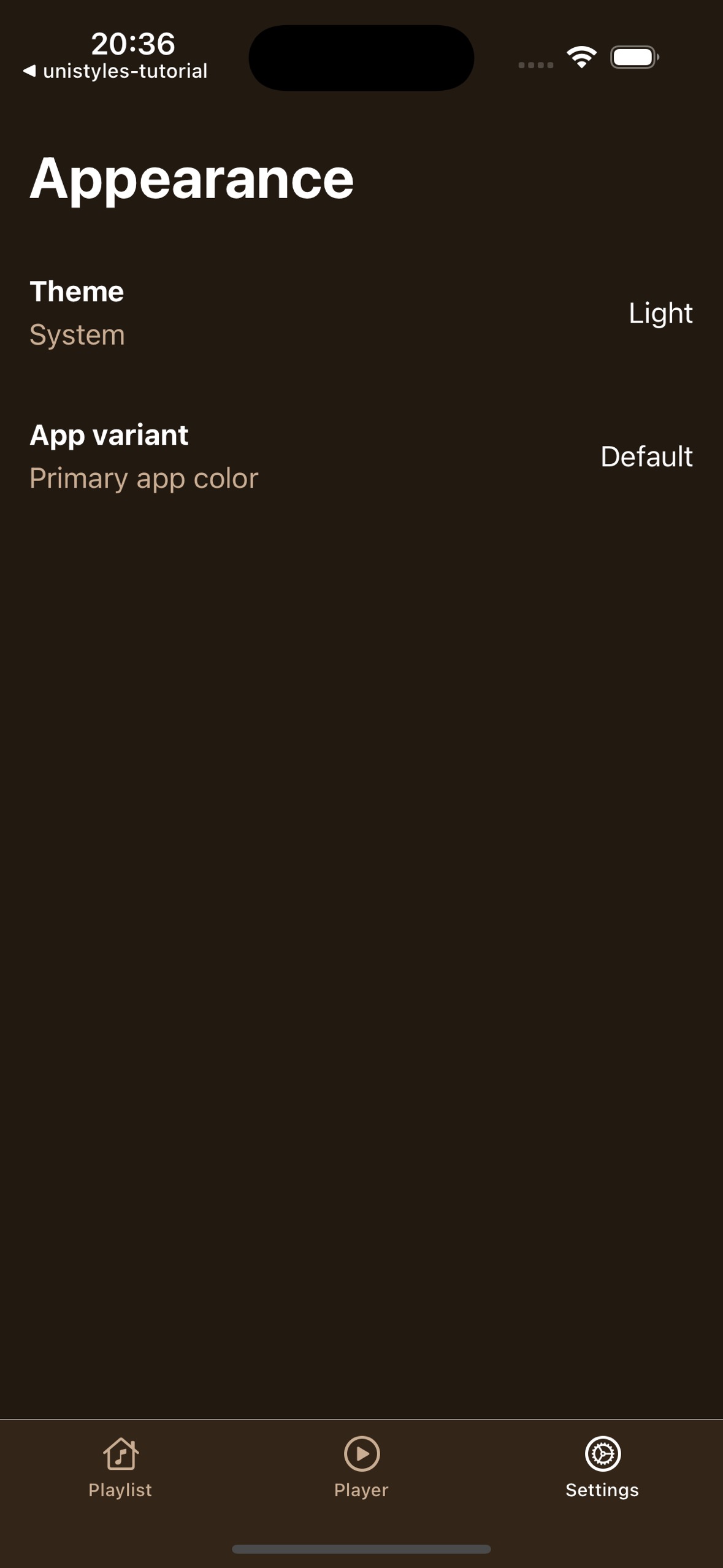
Perfect! Your settings screen now has interactive tiles that provide immediate visual feedback and navigate to the appropriate modal screens. In the next part, we’ll implement the functionality for these modals and show how to dynamically update themes and accent colors.